Pivot Tables are an invaluable tool for displaying and analyzing data of all types. They allow users to pivot all types of data so that the data is formatted exactly as the viewers of data would get the most benefit whether they are viewing a grid of data or they are viewing graphs that require axis data be in a specific pivot configuration.
“How do I get weather history data into a Pivot Table?”
The process to get weather data into a pivot table is accomplished in a few simple steps:
- Create and Copy a web-based, weather query URL string using a site such as Visual Crossing’s weather query builder. https://www.visualcrossing.com/weather-query-builder/
- In a new Excel Workbook choose “From Web” under the “Data” menu to create a Power Query and paste in the URL from the weather query builder above.
- Choose “Load to…” and “Pivot Table Report” to complete the final data load from the weather server into an Excel Pivot Table.
We will outline the 3 steps in detail below and in the matter of 5 minutes you can have a dynamic weather history query loading into an Excel Pivot Table.
1. Create a web-based weather query
The first step in the process is to build an historical weather query, and the easiest way to get started with historical weather is to use the Visual Crossing Weather web-based query builder. You can build your first query in only a minute by visiting https://www.visualcrossing.com/weather-query-builder/. If you don’t already have a Visual Crossing Weather account you will want to sign up for one now. If you need help registering, please see our guide on How to Sign up With Weather Data Services.
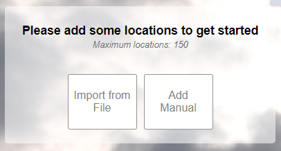
Once logged in, you will see the weather query page which will start by asking you for information about your query location.

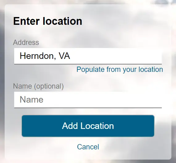
We will choose to ‘Add Manual’ and enter the location “Herndon, VA”.

Next we will be prompted to enter in the type of weather query you need. We will choose the “Historical Data” option and then select a dynamic date range for our query. In this example, we’ll fetch data for the last 30 days as a dynamic query so we don’t need to adjust the start and end dates as shown on this page. If you need only specific dates, then set the Start and End dates and skip over the next step. To create a dynamic range we must click on the “More Options” link.

Here we can adjust our query “Period” to use the last 30 days as a dynamic query from the date that the query runs. Every day the query is updated your data will be 30 days prior.

By clicking on “Request Weather Data” we will run the query and will get 30 rows of data as shown below for the period requested. We could use this data directly or download it as a CSV file. However, in this example we want to load weather data via Microsoft Excel’s Power Query capability and into a Pivot Table. So. we’ll generate the query URL string and copy it.

When we click on the “Query API” button near the top of the page, we will be taken to the API query page. That will allow us to copythe query URL String that we need to load our weather data. Simply copy the full URL as a GET request choose CSV as the output option. CSV is the fastest and simplest format to load data into Excel.

Then simply click on the “Copy full query” button and the entire query string will be loaded into your copy-and-paste buffer. We will paste this into our Excel Power Query later.
2. Create a Power Query in Excel
There are many ways to put data into our Pivot Table . Users can create tables, point to datasources and many other varieties to serve as the data for a Pivot Table. In this example we use Power Query because it is a live refreshable query which is perfect for our web query which fetches the last 30 days of history based on a dynamic end date of ‘yesterday’ and counts back 30 days for a start date. Open Excel, select the “Data” menu and select the link “From Web” to create a new PowerQuery.

When prompted, paste the URL of our Weather History Query into the entry box and click “OK”.

If you were successful you will now see the data pulled by the Power Query as results.

What we have created here is a Power Query datasource and connection to the weather server. At any time you wish to edit the query you can open the “Queries and Connections” window in the “Data” menu.
3. Load Data into a Pivot Table
To finish our query we need to tell Excel how to load it. Toggle open the “Load” button and choose “Load To…” this will offer us several options of how we want to load the data.

By Choosing “Pivot Table Report” Excel will create a Pivot Table for us automatically setting up our Power Query connection as the source. Click “OK” and an empty Pivot Table is created.

The data is now loaded into our Pivot Table but no data will show because the Pivot Table’s columns, rows and values have not been chosen. In this example we want the “Name” of our location to always appear, we want our dates to appear and finally we want a select set of weather variables to appear. By clicking on the fields we want in the “Pivot Table Fields” section we can create our table.

Simply begin by selecting fields you want to use. We have selected “Name” and our “Date time” field first. You should notice that based upon the data, Excel intelligently chooses those for the Rows. Next we add “Temperature”, “Precipitation” and “Wind Gust”. Excel then puts “Values” into the columns and the specific weather variables will show in the “Values” details section.

We can already see the power of the pivot table in action. All of our dates were sliced by months so that we can roll up months for easy viewing and total aggregation. Simply by toggling on the month value you can open/close the data. If you don’t want this feature you can remove “Months” from the rows and you will only see dates. Likewise you can slice by Year and other date/time values.
There is one task remaining. Notice how the Pivot Table assumes “Sum” as the aggregation for all data. This is not correct or useful for Wind Gust or Temperature but is perfect for Precipitation. We must adjust how the data is aggregated for totals. To do this click on the arrow toggle next to “Sum of Temperature” and change the aggregation to “Average”.

Note that the Name of the Value also changes to “Average of Temperature” for easy reading of what the total calculation method is for every variable. If you don’t want the name to be so long you can adjust it after selecting Average. Now repeat this operation for Wind Gust.
TIP: If your values have too many digits, simply click on the “Number Format” button and adjust to a number type and set the values of precision that you prefer.
We can now see the results of our work. At any time we can choose “Refresh All” from the “Data” menu to update our data dynamically.

Pivot Tables have many more powerful features that you can improve upon here but in just a few minutes we have a fully dynamic 30 days of history loaded directly into Excel. Please reach out to us at info@visualcrossing.com if you have any questions or need assistance.

