

NOTE
This Article refers to the legacy query interface. if you are already logged in , you can access the legacy page by clicking the link to the ‘legacy version’ as shown in the screenshot below

Overview
This article describes how to create annual, monthly and daily climate summaries for any location in the world using Visual Crossing Weather Data. The article uses the ‘Historical Summary’ feature of Visual Crossing Weather to create a report by analyzing the historical records over multiple years.
Once we have created simple climate summaries by year, month, week and day, we will look at additional options to create rich historical weather summary reports.
This article will be using the Visual Crossing history summary requests which is our statistical weather data API for retrieving historical weather and climate summaries.
Steps
The following steps are used to create an historical climate summary for a location:
- Create an account if necessary under https://www.visualcrossing.com/sign-up – please note that historical summaries require a corporate subscription at minimum.
- Log in to Visual Crossing Weather Data and navigate to the legacy page.
- Choose one or more locations by address or latitude and longitude.
- Create a ‘Historical Summary’ query for the selected location that shows the monthly climate normals for the past 30 years.
Step 1 – Access Visual Crossing Weather Data
The first step to creating our climate summary is to log in to https://www.visualcrossing.com/weather/weather-data-services and navigate to the legacy query interface or go directly to https://www.visualcrossing.com/legacy/weather/weather-data-services#/editDataDefinition
Step 2 – Choose one or more locations
We now select a location so we can create the climate report. In this case we are choosing New York, NY. Locations are entered by address or latitude, longitude value. For more information on entering locations, please see the Getting Started With Weather Data Services.
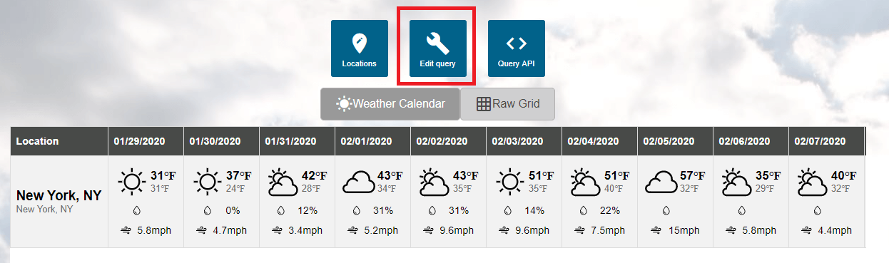
Step 3 – Create an Historical Summary report
Now we use the “Edit query” feature of the tool to create our historical summary. If you are currently viewing data such as the forecast for the selected location, please hit ‘Edit query’:
We can now select the type of query we would like to select. Hit ‘Historical Summaries’:
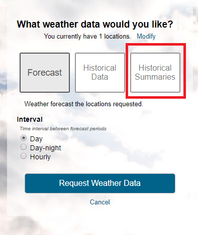
Creating our first historical summary:
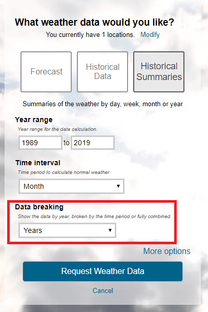
There are three main options to choose when creating an historical summary:
The year range for which to collect data – this defaults to the past 30 years.
The time interval – whether to create a summary by year, month day or other time interval.
Data breaking – whether the data is shown by year or for all years.
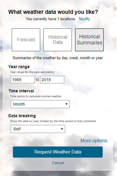
By default the report selects month, broken by ‘self’. Let’s hit ‘Request Weather Data’ to see what this means:
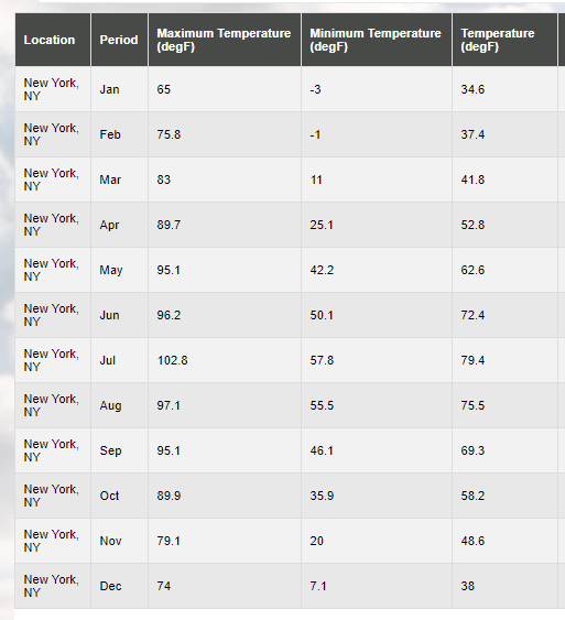
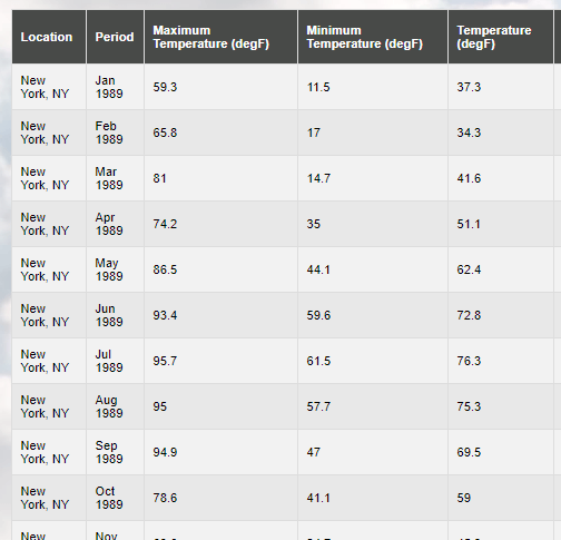
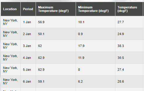
We now have a data set that shows the maximum, minimum and average temperatures in New York by month. There are many other weather data variables available – for now we will focus on temperature.
Being broken by ‘self’ means we obtain averages for all the intervals in question. For example, this report shows the highest ever January temperature in New York, NY is 65F and the lowest is -3F.
Now let’s see what happens when we modify the query to break by year:
We retrieve the following data with the updated settings:
In this case we still get results by month but rather than being results for all months of each type, the data set lists the summary by year and month. We can now see the monthly summary for January 1989, January 1990, etc.
The break by parameter allows you to choose a summary for each selected period type for all periods or break them out by year.
There is another breaking value, “None”, which will we will return to later in the article.
Changing the summary time interval
So far we have created reports by month. What happens if we want to create a report by another time period such as year, week or day?
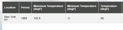
For this we can use the time interval setting. For example a year time interval, broken by years shows the annual summary for each year:

What happens if you set the break by to ‘self’? We create a report that summaries the data across all years just like we saw it create a report across all months. So we get a single row that summarizes the maximum, minimum and average temperature across all the selected years.
We can also create weekly and daily summaries:
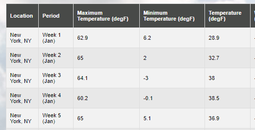
Weekly summaries
Daily summaries
How to create a summary for a particular date of the year?
We have shown how to create a simple summary report by year, month, week etc, but what happens if our requirements are a little more intricate:
We want to create a summary for June 15th so we know the typical weather for that date. To help give us additional data, we will assume that the weather within a few days either side of June 15th is the same. We will incorporate those additional days into our summary.
We will use some additional options in this so start by hitting ‘More options’ in the query editor.
First set the year range to the last 30 years and choose ‘Day’ as the time interval.
Now let’s filter the data to the days around June 15th – say June 10th to June 20th:

Let’s see how our data looks by hitting ‘Request Weather Data’:
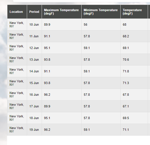
This isn’t really quite what we were hoping for. We want a single day summary in a single row. We don’t need to know the difference between the 10th, 11th or 20th of June. For our calculation we are assuming the weather on all of them is the same and we are just using them to add more dates for averaging (so we’ll have 300 days to sample not 30 days, one for each year).
We want to ‘collapse’ the data to no break by. We therefore change the data breaking to ‘none’

Now when we run the report we retrieve exactly what we are looking for:
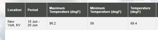
We have a single row that summaries the daily statistics for all days between June 10th and June 20th. This shows that the maximum temperature on any of those days in the past 30 years in 96.2F and minimum is 69.4
So this give us the three basic statistical value aggregations for the period in question. What happens if we want more detail. For example, while 96.2 F is the highest ever temperature, what is the normal daily maximum? For that we can use the next feature – “Create daily summary statistics”.
How do I create daily statistics for historical weather summaries and climate reports?
When you create a simple historical summary, the weather variables are summarized by their default aggregation method for all time periods in question. You can add detailed daily statistics easily. See How do I create daily statistics for historical weather summaries and climate reports?